Executive summary
Challenge
Data revealed a critical gap in the SnappFood user journey: 50% of users were adding items to their cart without ever viewing product details. This “blind buying” correlated with negative feedback about food quality not matching expectations.
Solution
We redesigned the product card architecture, moving from a static list to a modular card system. The goal was to increase informed purchasing without reducing conversion.
Result
- +8% increase in Product Detail Page (PDP) views
- No drop in Add-to-Cart conversion after iteration
- ~30% less operational time setting up promotional campaigns
The problem: “The Blind Buy”
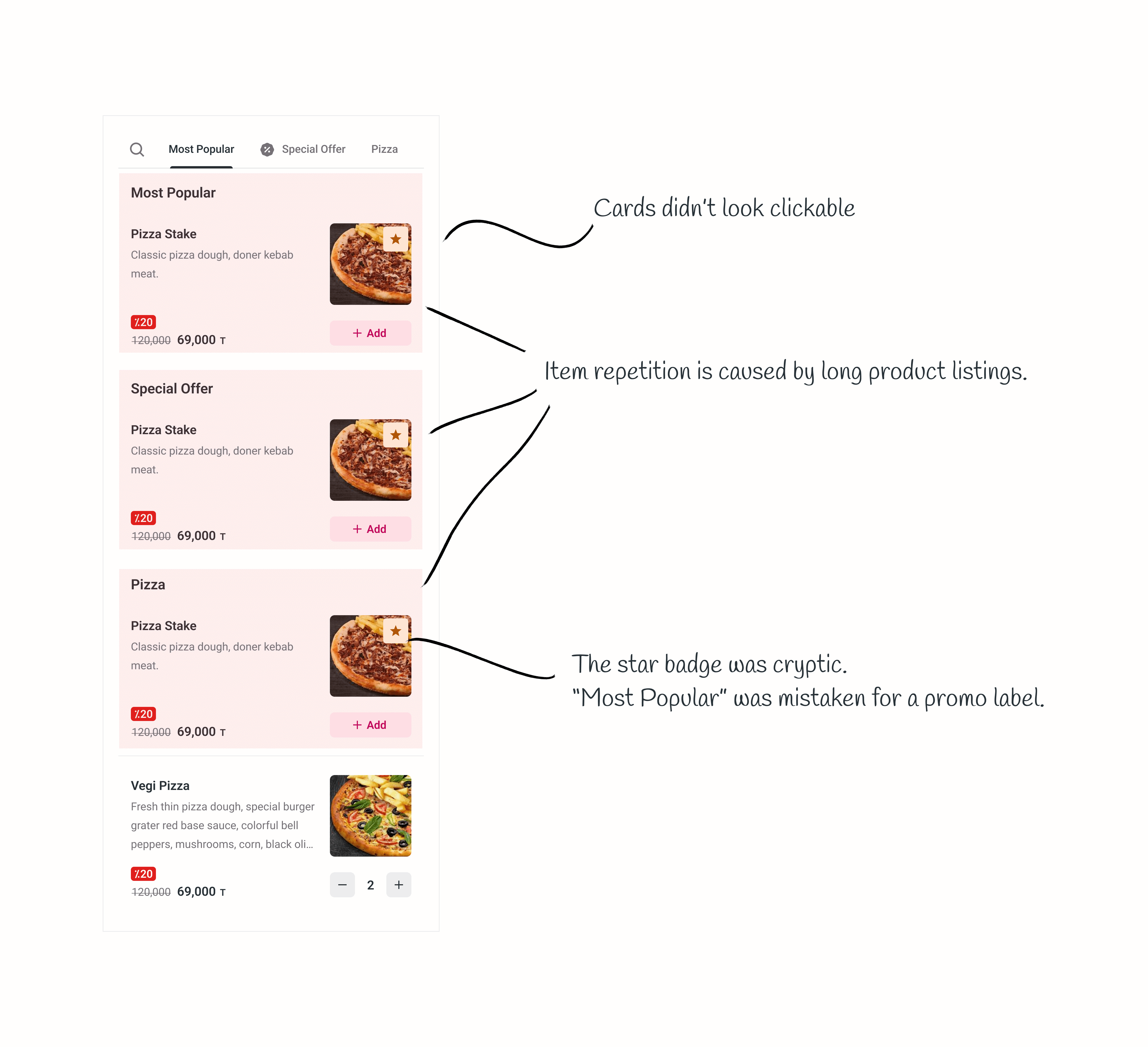
We analyzed 200,000+ sessions. Around 142k users added items directly to cart, while only 72k clicked to view more product photos and ratings.
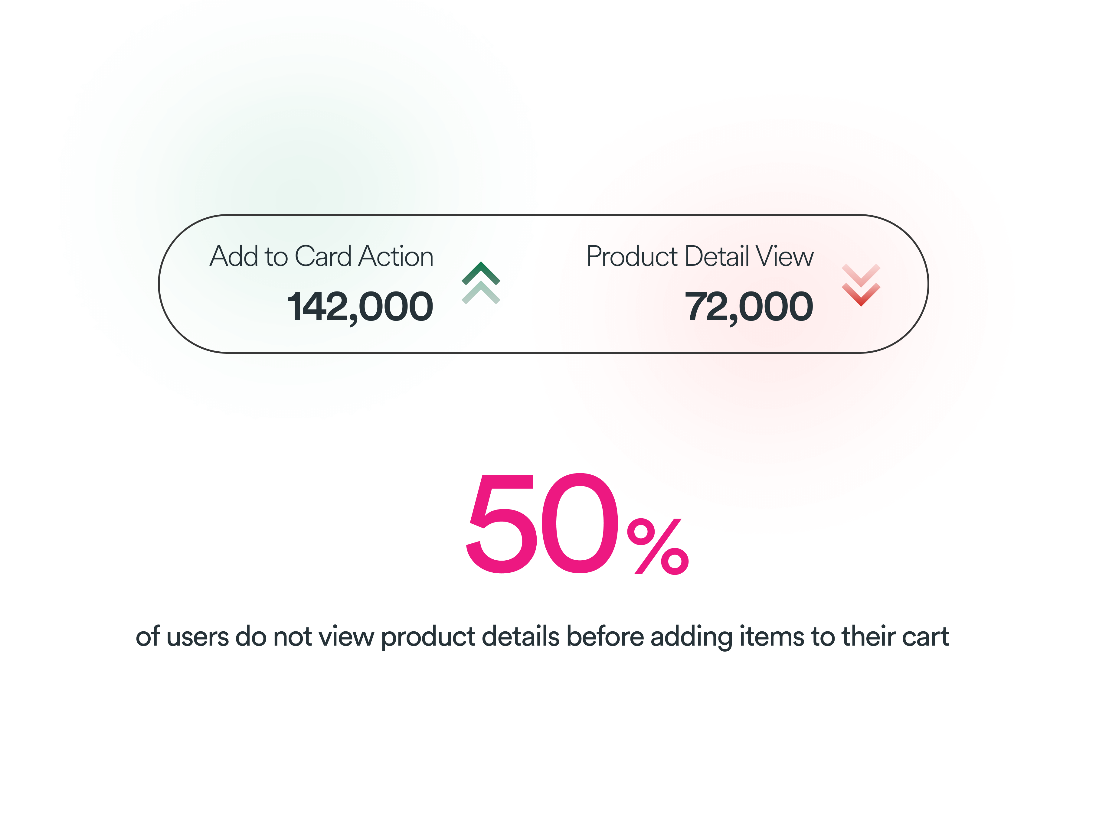
The old card hierarchy gave most visual emphasis to the Add button. In usability testing, 3 of 5 participants did not realize the image could be tapped to see more product information.
Goals and success metrics
- Primary: increase click-through rate to PDP by 10%.
- Guardrail: maintain Add-to-Cart conversion.
- Secondary: reduce negative feedback related to product mismatch.
The process: embracing failure
Experiment V1 — The “clean” mistake
Hypothesis: removing the inline Add button would encourage users to visit details and make more informed purchases.
Result: failure. PDP views rose 40%, but conversion fell 10%. Forcing exploration into the purchase flow created too much friction.
Experiment V2 — The hybrid
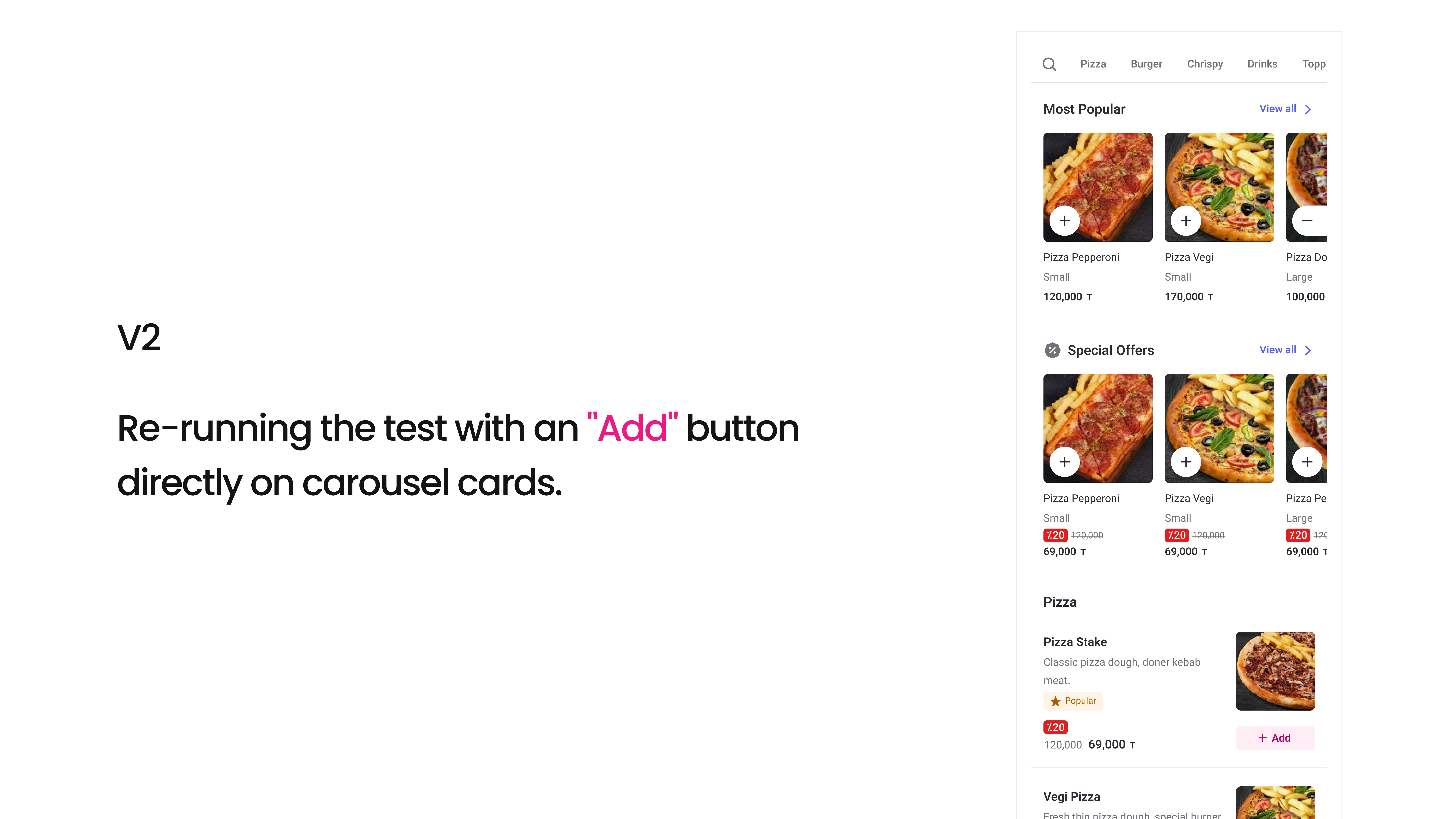
Hypothesis: make the card itself open details while retaining a distinct Add button for people who already know what they want.
Result: success. PDP views increased 8%, and Add-to-Cart conversion returned to baseline.
The solution: a modular system
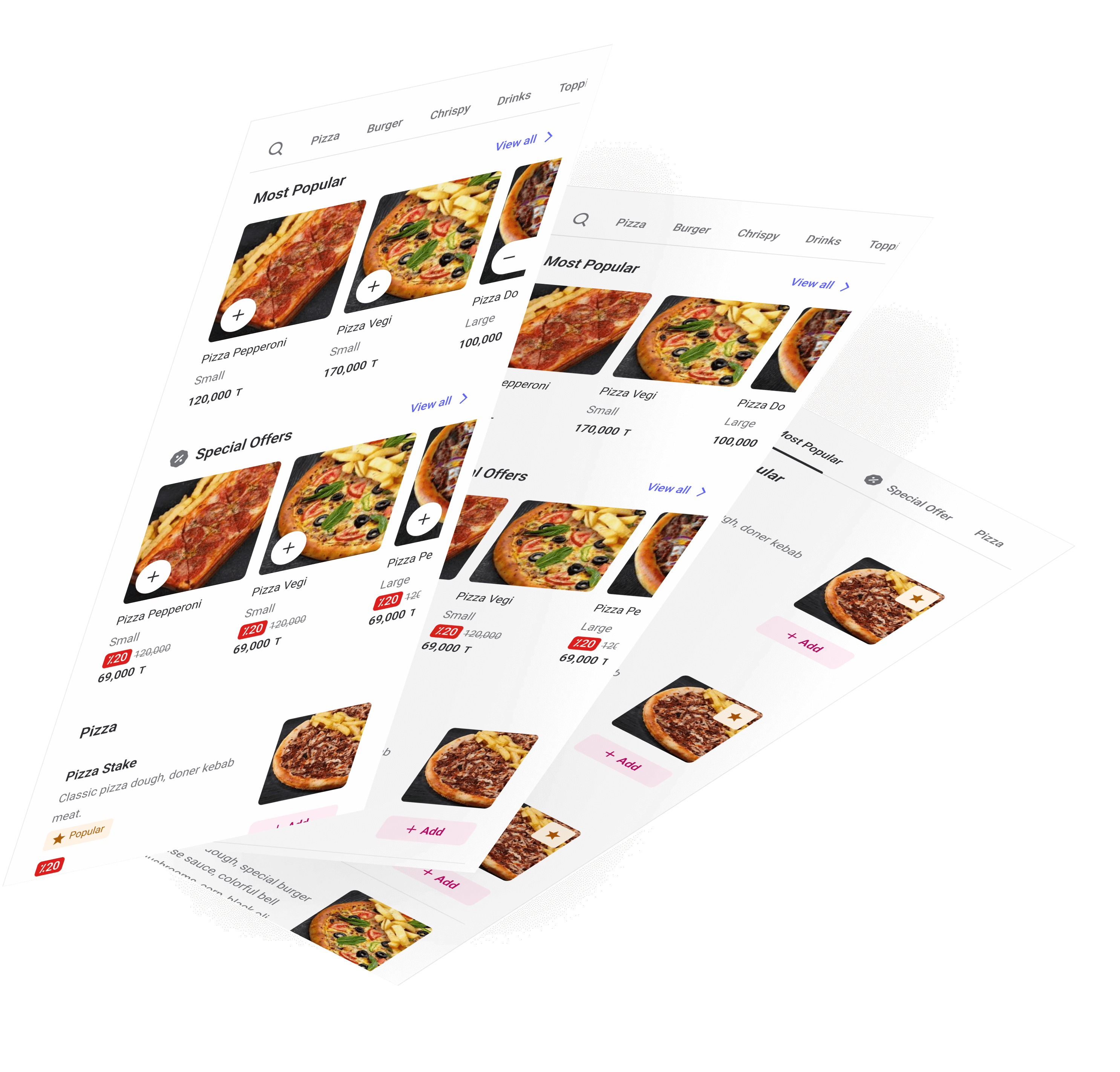
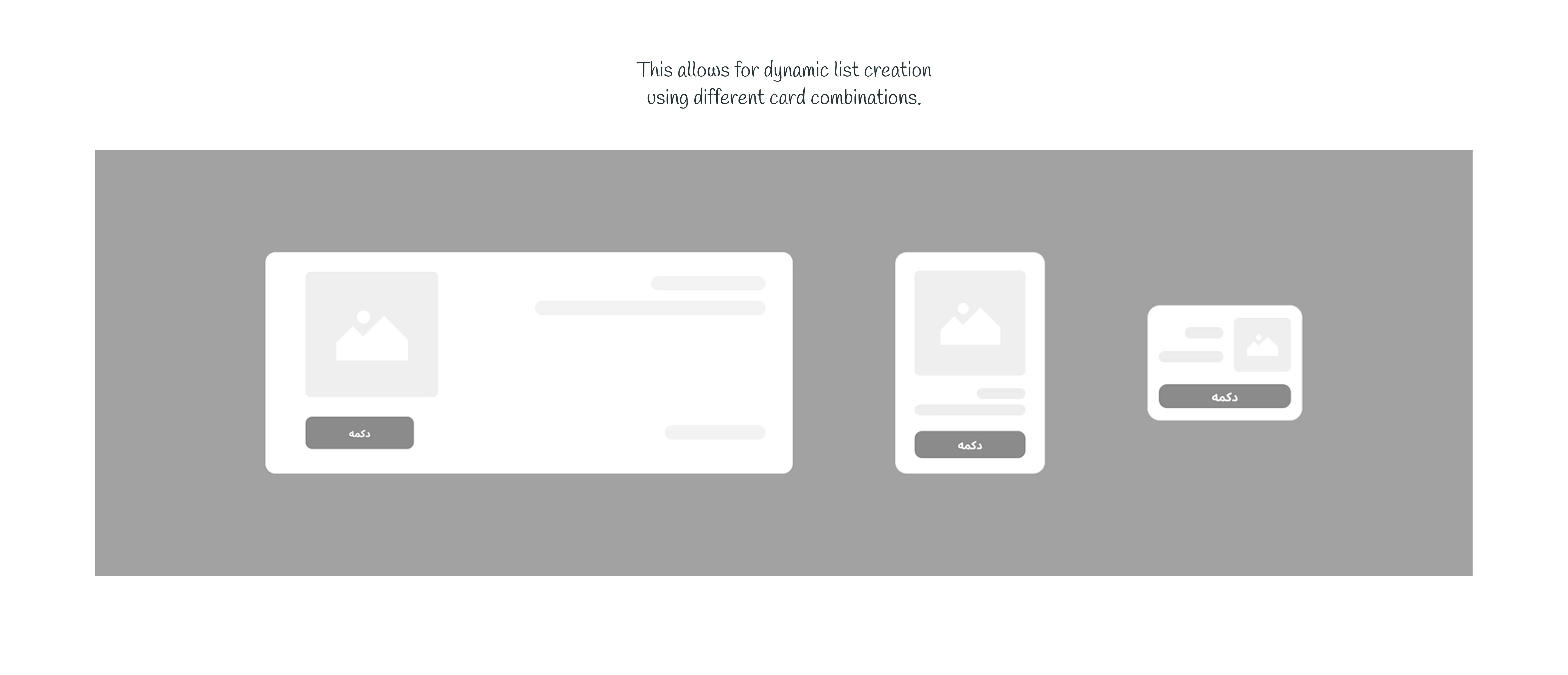
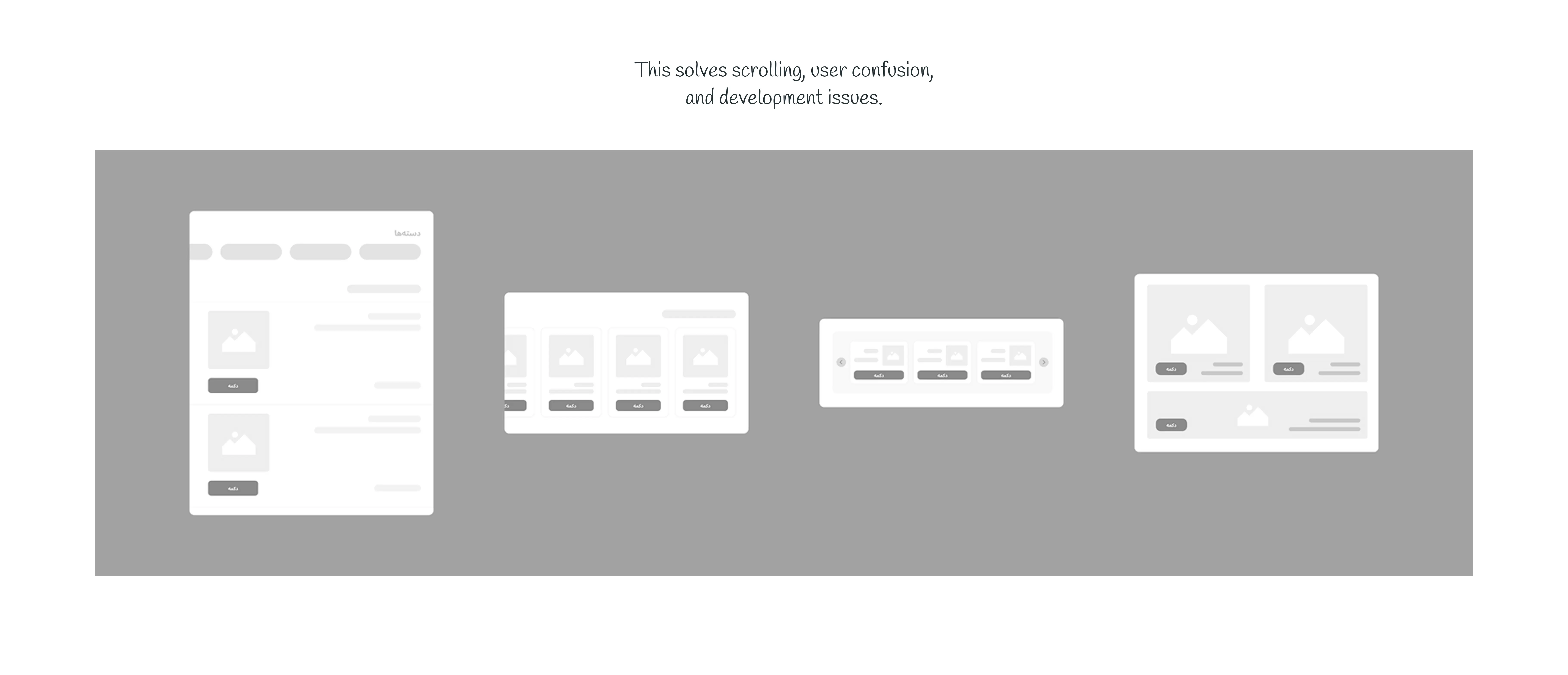
We built a reusable product-listing component library adaptable to restaurant, café and grocery contexts.
- Unified tap targets: card opens details; Add stays immediately accessible.
- Smart thumbnails: aspect ratios adapt by category.
- Scalable variants: list, carousel and compact cards within the design system.
Outcome and business impact
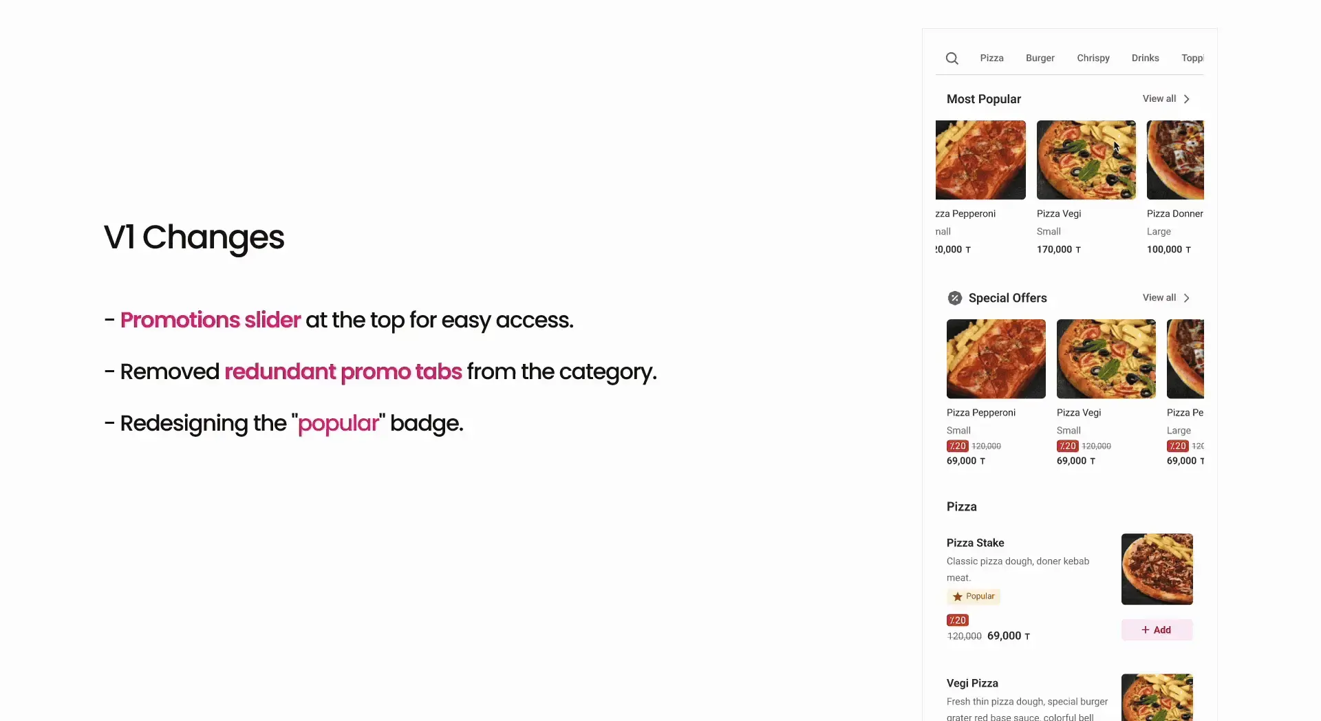
The new cards rolled out to all users in October 2023. Detail-page views improved 8% with no loss of baseline Add-to-Cart conversion. The modular approach also reduced new promotional block handoff/setup time by around 30%. Long-term NPS was still being collected.
Reflection
Friction is not always the enemy, but it should be optional. Forcing people to view details hurt the business; inviting them to view details improved the experience without slowing down decisive purchasers.